In the world of design, it becomes apparent people are typically drawn to curves or straight lines and angles. We try to get people to see that a balance is often where the sweet spot is. In newer architecture, it’s often difficult to incorporate curves on the exterior of the home. Let’s face it – it is much more difficult and expensive to bend wood, masonry and metal, than it is to keep it straight. So, we accomplish the balance with landscape, light fixtures and with the use of color.
Because of the added difficulty and custom work that goes into creating arched detailing in architecture, when we do see it, it evokes a feeling of grandeur and artistry. These homes are certainly no exception.

Everything about this door is right, especially in context to the rest of the home. The honey color stain is the perfect balance for the surrounding multi colored brick ; the black hardware helps the door to “pop”; the keystones above the door keeps it from being too boring; the oval address sign and coral flowers accent the door without outshining it; and the arched windows and steep angle of the entry help to make it unique and striking.

This turquoise arched door will impress even the most select architecture enthusiasts. It embodies exactly why the arched front door was first created in very early architecture – to impress its visitors. The recessed multi-panels give the over-sized door dimension and add to its personality. The deep but bright turquoise wakes up the entire exterior and contrasts well with the surrounding brick and the niche created by the recessed placement of the door only adds to the charm.

This next door again exemplifies the charm instantly created with an arched front door. These homeowners went all in on charm! Pastels on home exteriors are never easy and this one is pulled off beautifully. We’re sure, upon entry, the smell of fresh-baked cookies is forever there as well…
The dramatically offset door, accented with triple high-peaked risalite detailing was well thought out by it’s creator and the homeowners use of color serves it well.


We like the subtlety of this next arch door. The home has a very masculine feel -Tudors typically feel more masculine with the sharp contrasting colors of the stucco and beams, the dark coloring overall and the necessary strong details to hold their own against the other pronounced features of a Tudor home. The lack of a dramatic curve to the door is in keeping with this more masculine home – the more curves you have – typically the more feminine a space or detail will feel. The limestone detailing above the door helps the arch standout more than it would otherwise and we love the deep stain that gives the door the serious vibe it’s going for.

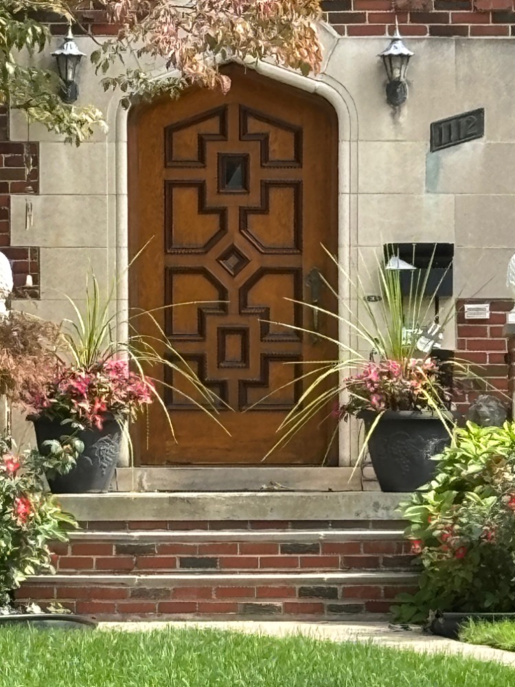
The geometric detail of this next door is stunning. We’re not sure if the contrasting stain was originally there when the home was built around 100 years ago – but it works perfectly here. It’s rich and dramatic and the gothic influence of the peak adds to its appeal.


Leave a comment